Navigating MARTA
The redesigned MARTA app brings together trip planning, real-time updates, and ticketing into a single, intuitive platform. It helps users navigate complex journeys with live service alerts, personalized route suggestions, and station-specific guidance. Designed for both daily commuters and first-time riders, the app improves confidence and clarity across every step of the transit experience.
Timeline
10 Weeks
Role
Designer [solo]
Skills
CAD, Figma, Illustrator,

Understanding the Problem Space
*
Understanding the Problem Space *
[OPPORTUNITY 1]
Unifying the Digital Experience
MARTA currently uses three separate apps—MARTA On the Go, Breeze Mobile, and See & Say—for trip planning, fare payment, and safety reporting. While each app serves a distinct purpose, the lack of integration presents an opportunity to streamline the user journey and create a more cohesive and intuitive experience for riders.
[OPPORTUNITY 2]
Rebuilding Rider Confidence
While many transit systems have begun to rebound from the pandemic, MARTA’s 2024 rail ridership remains below pre-2020 levels. This presents an important opportunity to re-engage riders by enhancing reliability and delivering a more user-centered experience across touchpoints.
Design Objective
As MARTA plans for a 10–15 year system expansion, an integrated and user-centered digital interface is essential for making the rider experience more seamless, accessible, and engaging.
This points to the need for a unified platform that combines essential services while prioritizing user personalization and real-time navigation.
Initial Research Phases
01
Observing MARTA’s Physical and Digital Wayfinding
02
Interviewing Riders and Key MARTA Stakeholders
03
Benchmarking Leading Transit Apps and Systems
01 Observing MARTA’s Phyical and Digital Wayfinding
Breeze Mobile 2.0

Key Features
Digital payment using QR code
Ticket purchases and Breeze card value top-up
Basic trip planner functionality
Pain Points
Generic QR screen with poor hierarchy
Ticket purchase is slow and unintuitive
Service alerts hidden from main navigation
Route info is static; no live updates


MARTA On The Go

Key Features
Live train and bus arrivals
Route schedules for rail, bus, and streetcar
System and route maps
Nearby stops based on location
Pain Points
Train schedules are cluttered and hard to scan quickly
Alert info is lacks clarity and importance in hierarchy


Key features are hidden in secondary menus

See and Say 2.0

Key Features
Report safety concerns and access emergency call with location sharing
Receive alerts and view recent safety updates
Includes basic trip planning and location sharing tools
Pain Points
Overloaded homepage makes navigation difficult
Emergency form is lengthy, slowing response time


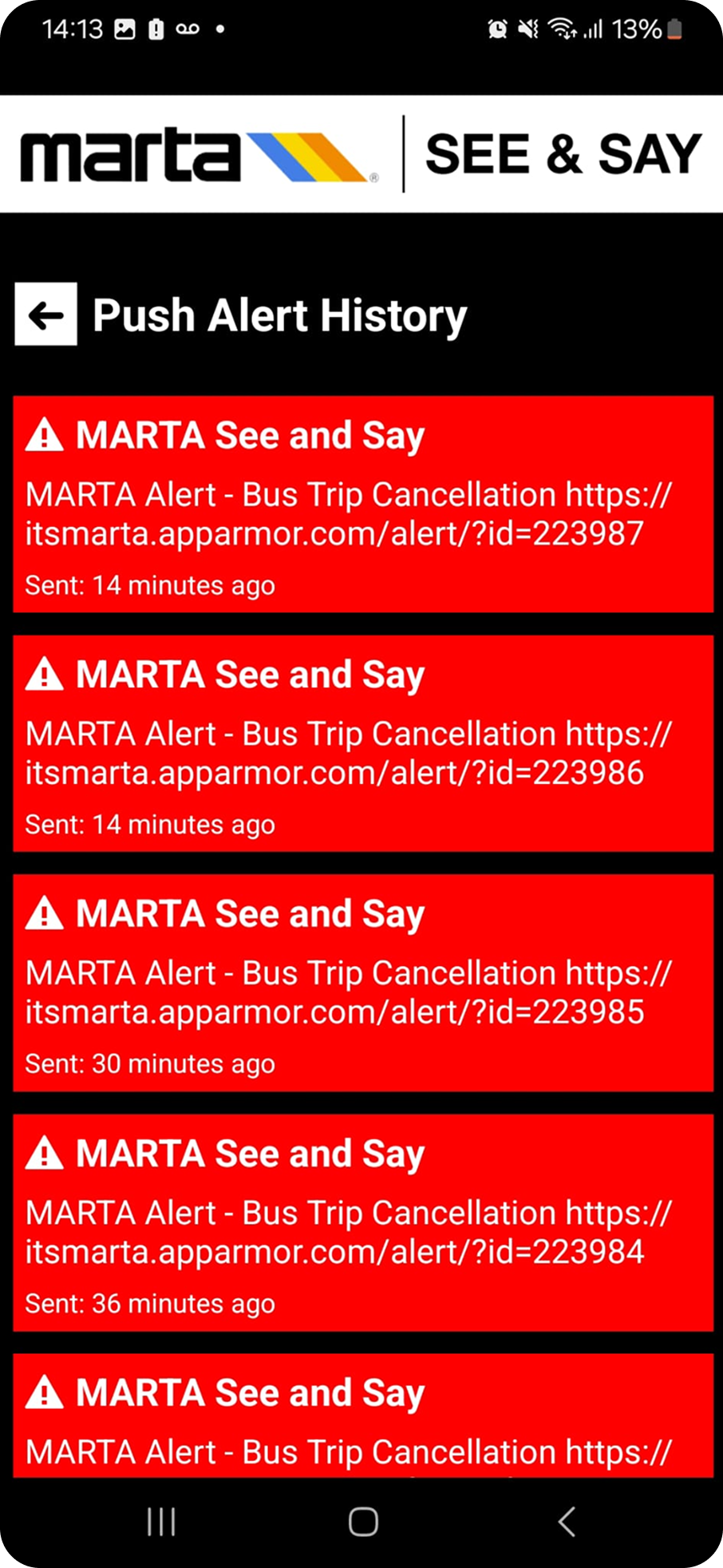
Alert history is cluttered, with confusing use of urgency signals
Location sharing is hidden and not live-updating
03 Interviewing Key MARTA Stakeholders

From MARTA’s Director of Art in Transit
Visual design supports navigation: Art and visual landmarks help users feel oriented and safe—digital UI should echo this with clear visual cues and consistent layout.
Cultural identity matters: Any app updates (e.g. station naming or route labeling) should respect local context while improving clarity for first-time users.
Major events create new flows: For events like the 2026 World Cup, digital tools can play a role in guiding unfamiliar users with intuitive navigation and personalized routes.

From MARTA’s Creative Services Manager
Consistency builds trust: Icons, colors, and typography should be standardized across physical and digital platforms for a cohesive rider experience.
Reduce information overload: Current systems overwhelm new users—digital UI must simplify messaging and surface only what’s essential in the moment.
Digital isn’t universal: Not all riders rely on mobile tools—interfaces must be intuitive enough for infrequent or low-tech users without assuming expertise.

KEY FEATURE 1
Custom Landing Page & Sign-In
KEY FEATURE 2
Smart, Personalized Trip Planning
KEY FEATURE 3